The Sweepstake
Challenge
When a Garmin user finishes the Ahotu Marathon Challenge, they get a link. Everything after that link was ours. Claim, choose, verify, create an account, confirm. Six screens, and two things they had to do at once. Never make the guaranteed reward feel like something you could lose. Never slow down someone who arrived with momentum.
Users arriving from Garmin have no account and no familiarity with the site. They arrive with a 15% discount already earned, and an optional sweepstake for one of seven race packages on top of it. Two rewards: one certain, one not. The risk was that people would think entering the sweepstake meant gambling the discount.
Ahotu ran the Ahotu Marathon Challenge inside Garmin Connect's partner programme, which has also hosted campaigns like Disney's 100 Years of Wonder and Starbucks' March Steps. Every campaign works differently, but the shape is the same. A brand builds something inside Garmin. The user completes it. Garmin hands them over to the brand. That handover is where this project lived.
Garmin's own flow ends with a button and a blank frame labelled partner website. Their spec stops there. The six screens behind that button are this project.
BEFORE JOINING: Finding the challenge inside Garmin Connect, reading the terms, joining.
IN PROGRESS: Distance tracked automatically, badge locked until the target is met.
COMPLETED: Redeem Your Reward, and then a blank frame. Everything after that button had to be designed from nothing.
Six screens had to do two jobs at once: win over someone who had never heard of Ahotu, and enforce rules that user would never see.
Had to convert strangers
- Cold traffic from a Garmin link, no Ahotu context
- The discount had to feel safe. Entering the sweepstake could never look like a condition for keeping it
- The reward had to be easy to find again when the user came back
Had to survive the rules
- Four code states: invalid, used, expired, generic failure
- Claim check on the account, separate from the code check
- Geographic exclusions enforced at entry and again at draw
How might we make a sweepstake feel trustworthy without ever making the guaranteed reward feel conditional?
The first pass was boxes and labels. Package One, Package Two, Package Three, deliberately unresolved, because the question at that stage wasn't what the packages were. It was whether the sequence held, and where a user could fall out of it.
First pass, before the flow was resolved. The claim page still carries a code already filled in, and the terms placement is marked in two competing positions. The packages are numbered rather than named, because what they were wasn't the question yet.
Later, once the flow had settled into something we were confident in, a version had to be made for Garmin. They needed to see what happened on their participants' side after the handover. Not to approve the visuals, but to understand what those users would walk into. Every screen was annotated with its purpose, in sequence, so someone who had never seen the product could follow it start to finish.
Built for Garmin, not for the team. Each screen carries a note explaining what it does and why it sits where it does.
Four error states, not just a happy path
The claim page confirms the guaranteed discount first. The three steps below it set expectations for what follows, and the sweepstake appears only inside step one, labelled optional, with the discount restated next to it. A user who reads nothing else still sees that the 15% is already theirs.
The same URL resolves four other ways, each with its own copy and its own way forward.
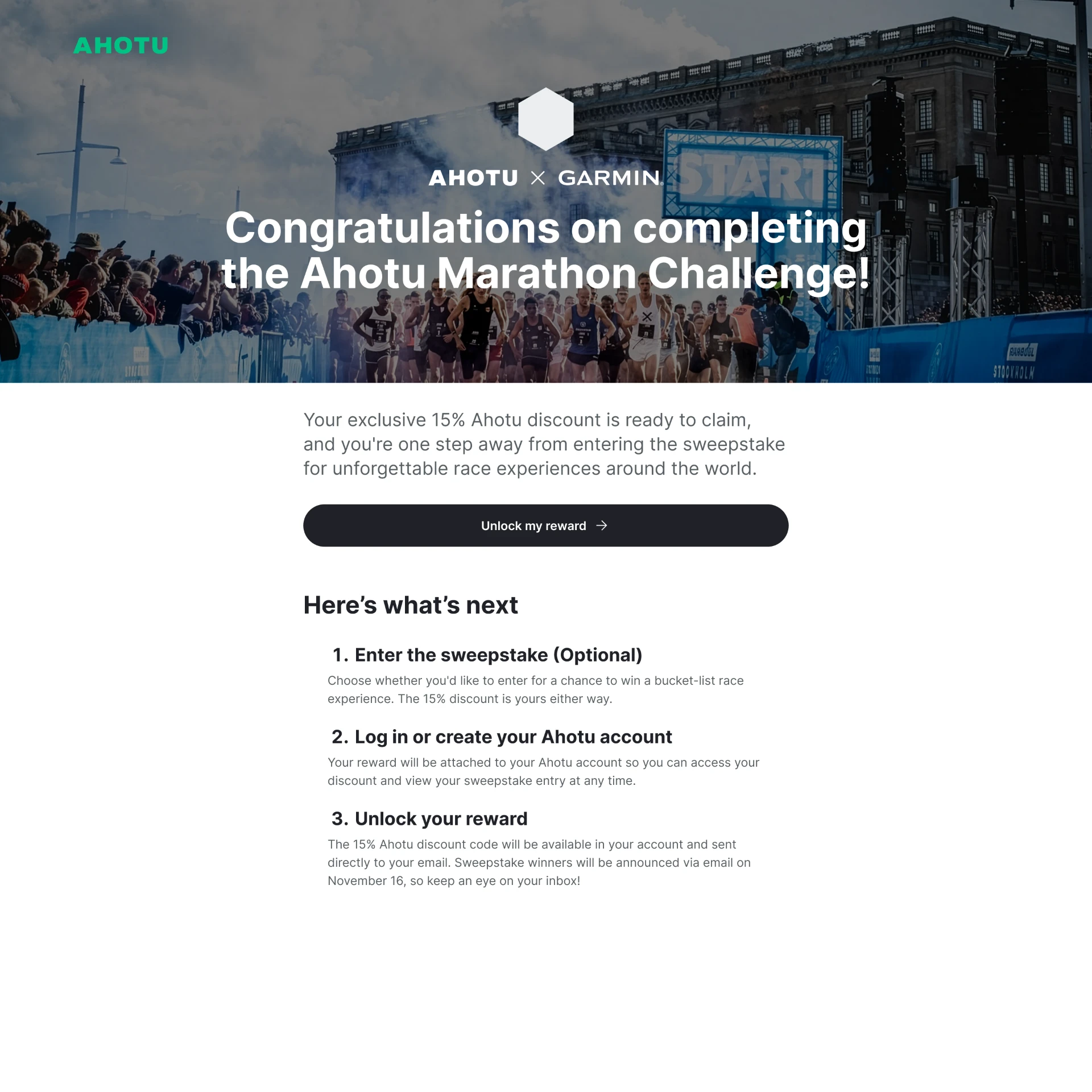
THE CLAIM PAGE: Discount confirmed first, sweepstake introduced second and marked optional, with the 15% restated next to it. One button, three steps, no code.
Seven real packages, one selection
The selection screen keeps the page quiet until asked. A single closed drawer, a headline, and a skip link, with nothing else competing for attention. Skip the sweepstake stays visible at every stage, so opting out never requires backing out.
This is the only screen in the flow carrying a full background image. Everything before and after it is a task: claim, verify, create an account, confirm. This one is the aspirational moment, and it's the only place that treatment earns its keep.
Single select, not multi. Letting users pick several packages would have implied better odds, which isn't how the draw worked.
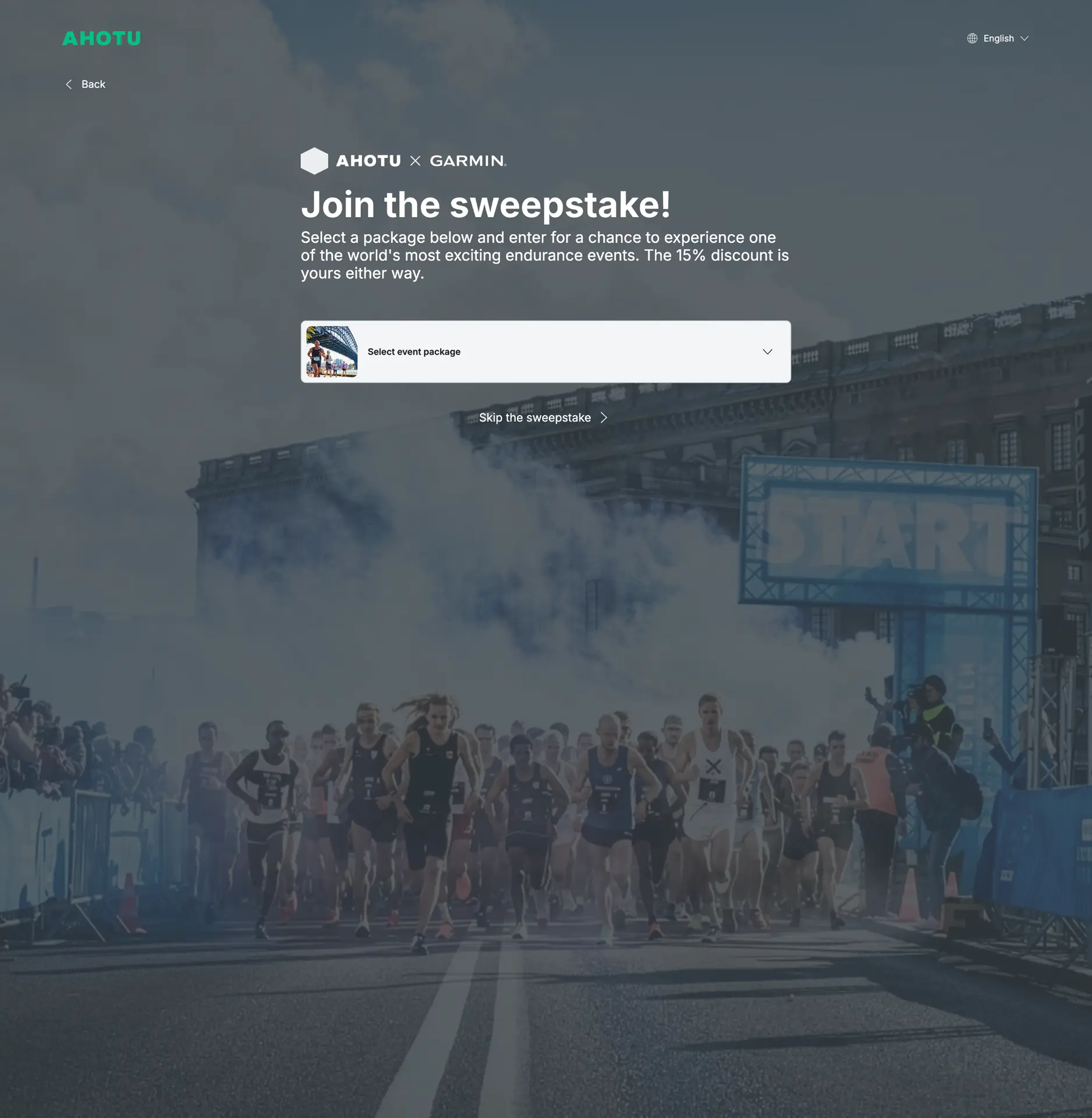
DRAWER CLOSED: One decision on screen, and a way out of it. The 15% discount is restated in the standfirst so the user is reminded what they keep regardless.
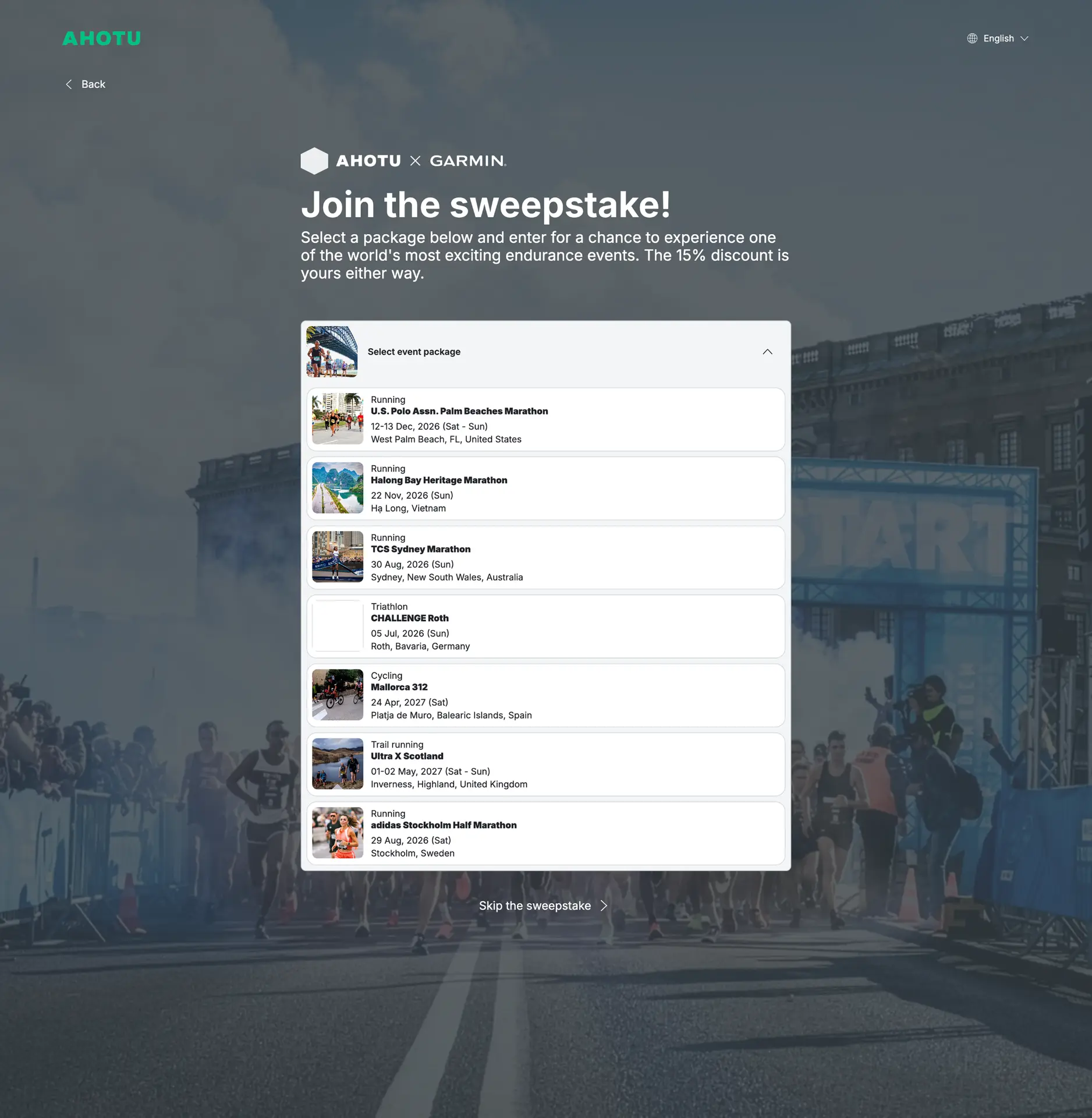
SEVEN PACKAGES: Running, trail, cycling and triathlon. Discipline, name, date and location on every card. Enough to choose from, not enough to read.
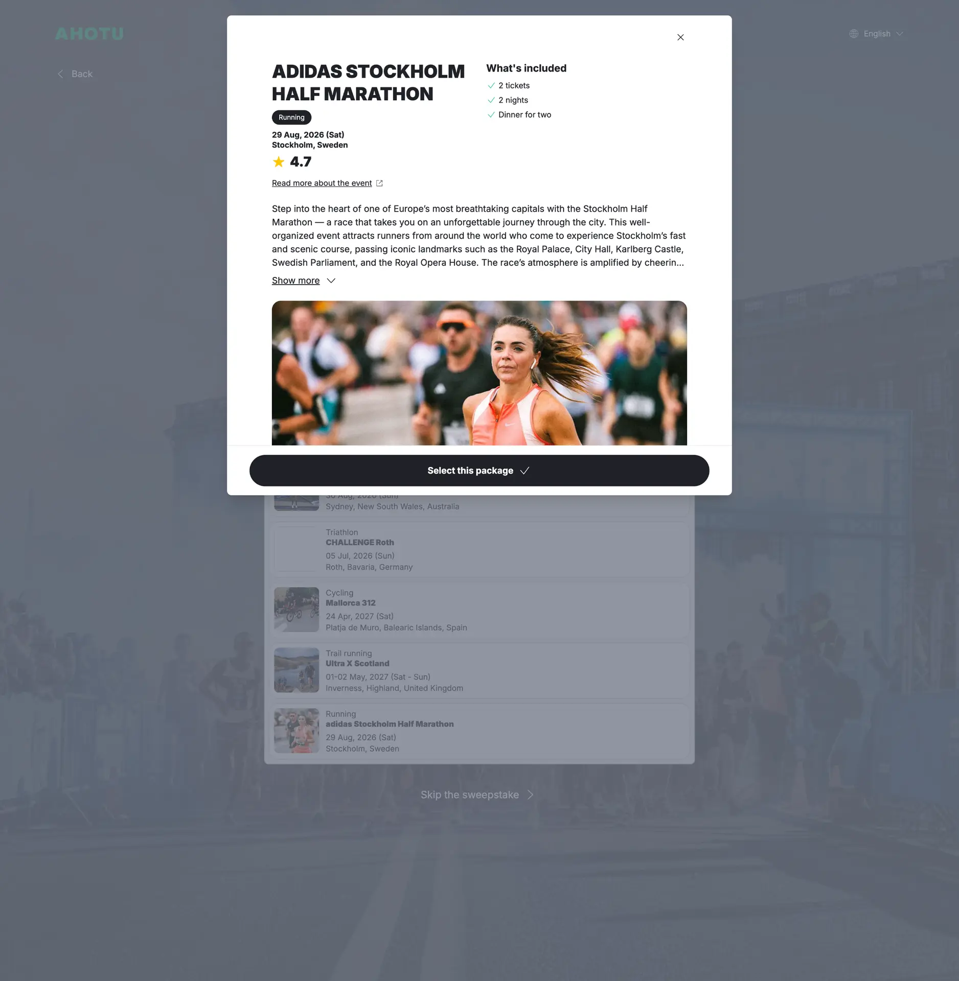
THE DETAIL MODAL: What's included sits top right, above the fold, because it's what decides the choice. The description truncates behind Show more, and the CTA stays pinned while the content scrolls behind it.
New and existing users, one outcome
Two kinds of user arrive at this point: people who already have an Ahotu account and people who have never had one. Both end up in the same place, with the same confirmed entry and the same reward attached to their account.
Country of residence is checked against the excluded list before any of that. Before signing in with Google, before creating an account. Asking afterwards would mean telling someone they had been disqualified after they had already done the work.
For most of these users, the account is brand new. They are looking at their Ahotu profile for the first time, and the only thing on it is the reward they just claimed. So the reward card had to carry the whole page: state clearly what they have, when it expires, and how to use it, without assuming any familiarity with the rest of the site.
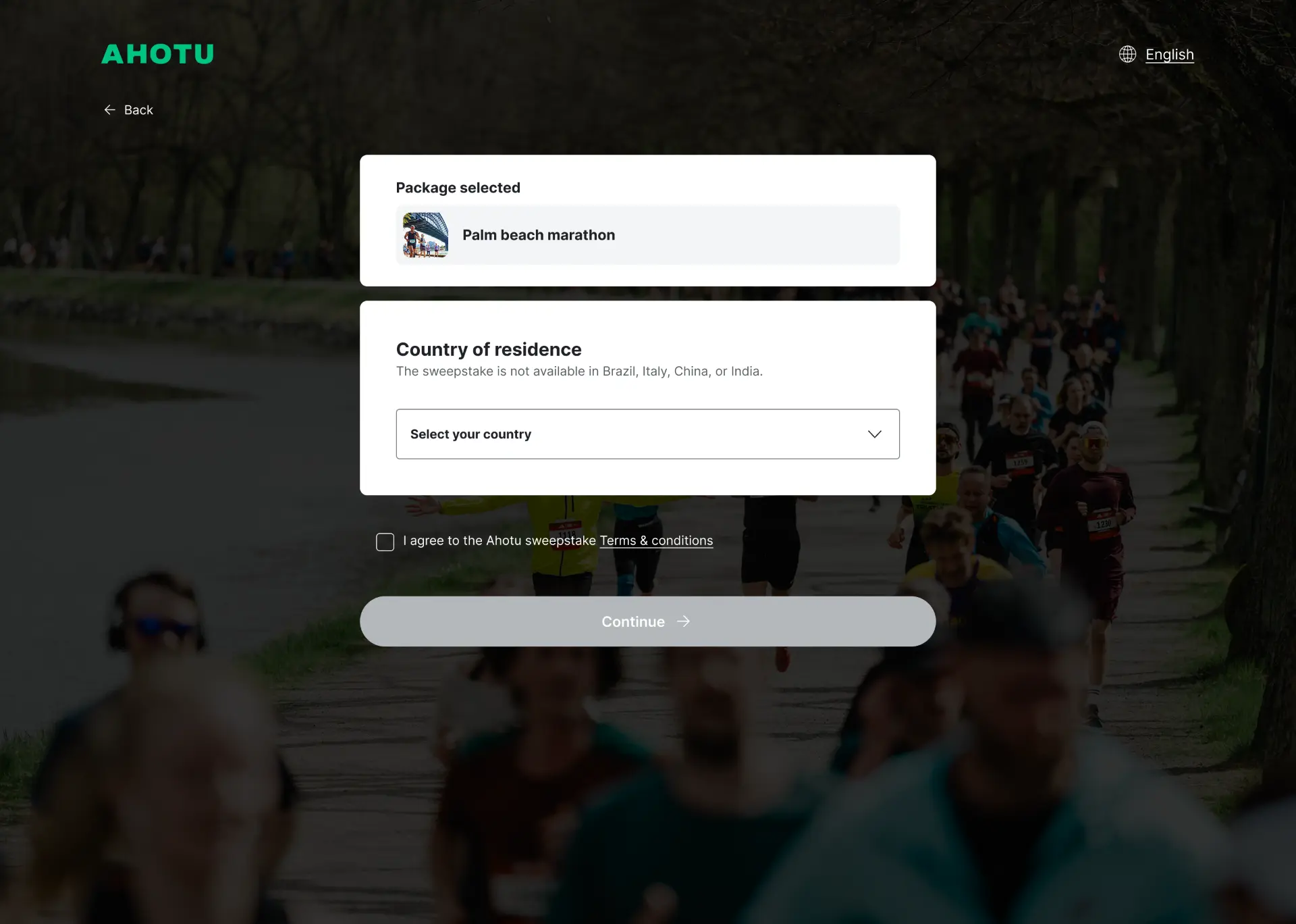
COUNTRY FIRST: The selected package is confirmed at the top so the choice isn't lost. Excluded countries are named in plain text above the field rather than discovered by selecting one. Terms sit directly above the CTA, which stays disabled until both are satisfied.
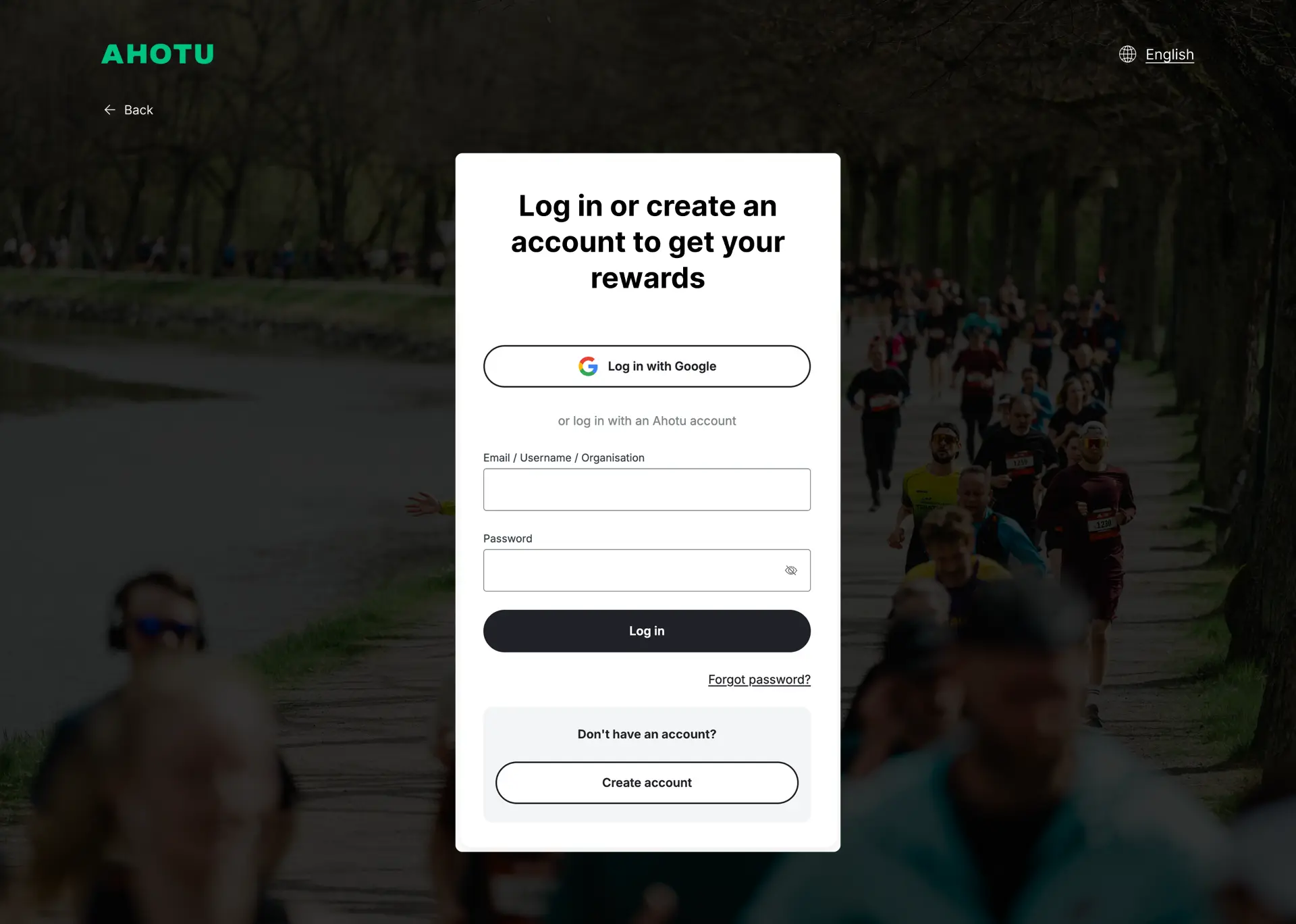
LOG IN OR CREATE: One screen for both kinds of user. The heading says what the account is for: to get your rewards. The step is part of collecting the reward, not a gate standing in front of it.
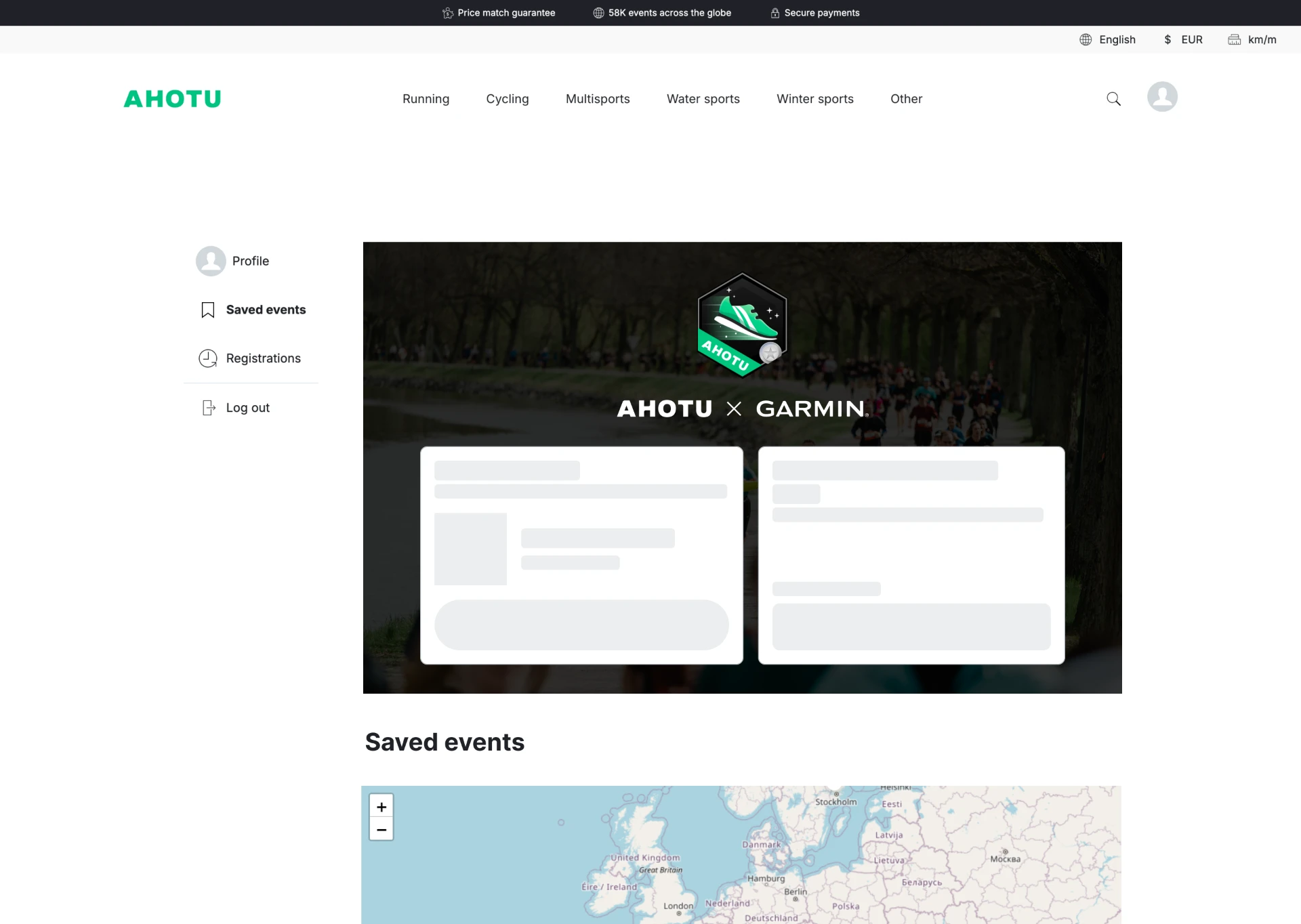
LOADING: Skeletons match the shape of what's coming, so the page doesn't reflow when the data lands.
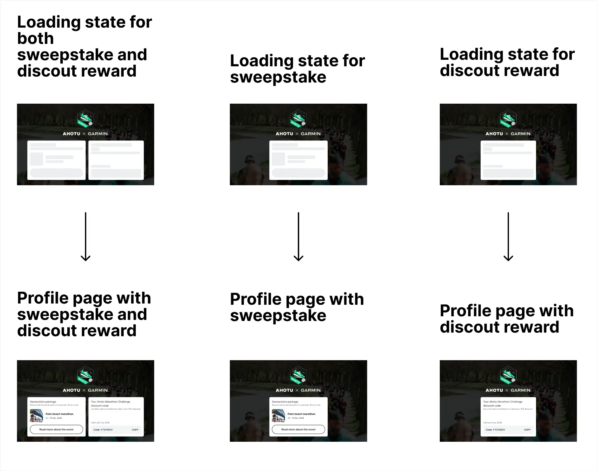
THREE STATES, SPECIFIED: Handover sheet for development. Each state is drawn twice: the skeleton and the resolved page beneath it.
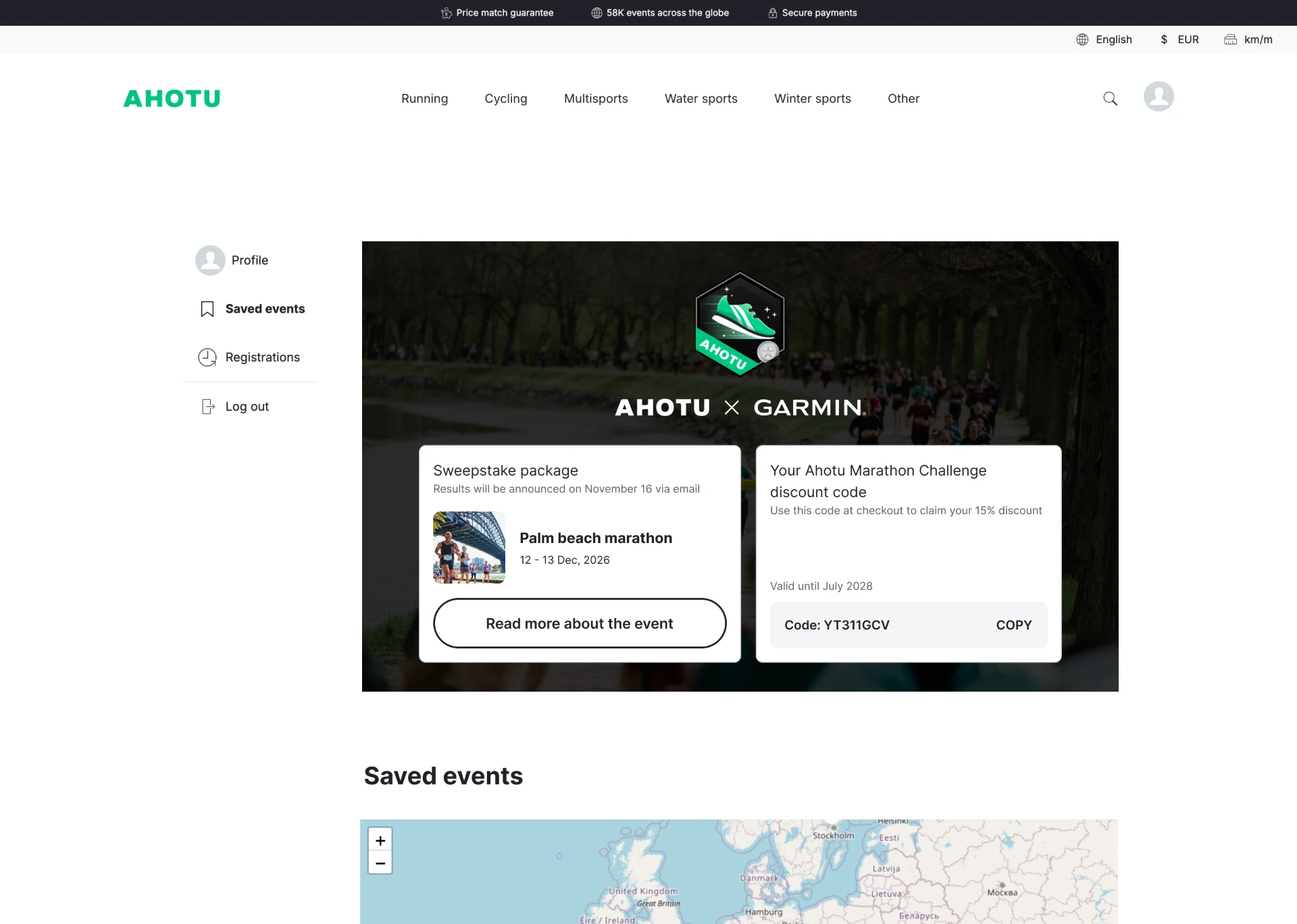
BOTH REWARDS: Sweepstake entry on the left with the announcement date, discount code on the right with its expiry and a copy control. The code is the thing users return for, so it's the thing that can be copied in one action.
Four emails, one badge, ten languages
Four email variants, depending on the path taken. Confirmation with both rewards. Confirmation with the discount only, for users who skipped the sweepstake. A message for people who were not selected, sent to everyone entered who wasn't drawn. And a winner email, which goes to a handful of people and was left deliberately simple at this stage.
The email for people who were not selected was the one worth spending time on. It goes to the largest group by a wide margin, and it's the only message in the set that has to deliver disappointing news. It leads with the effort rather than the result, and it puts the discount code back in front of the user at exactly the moment they might otherwise disengage.
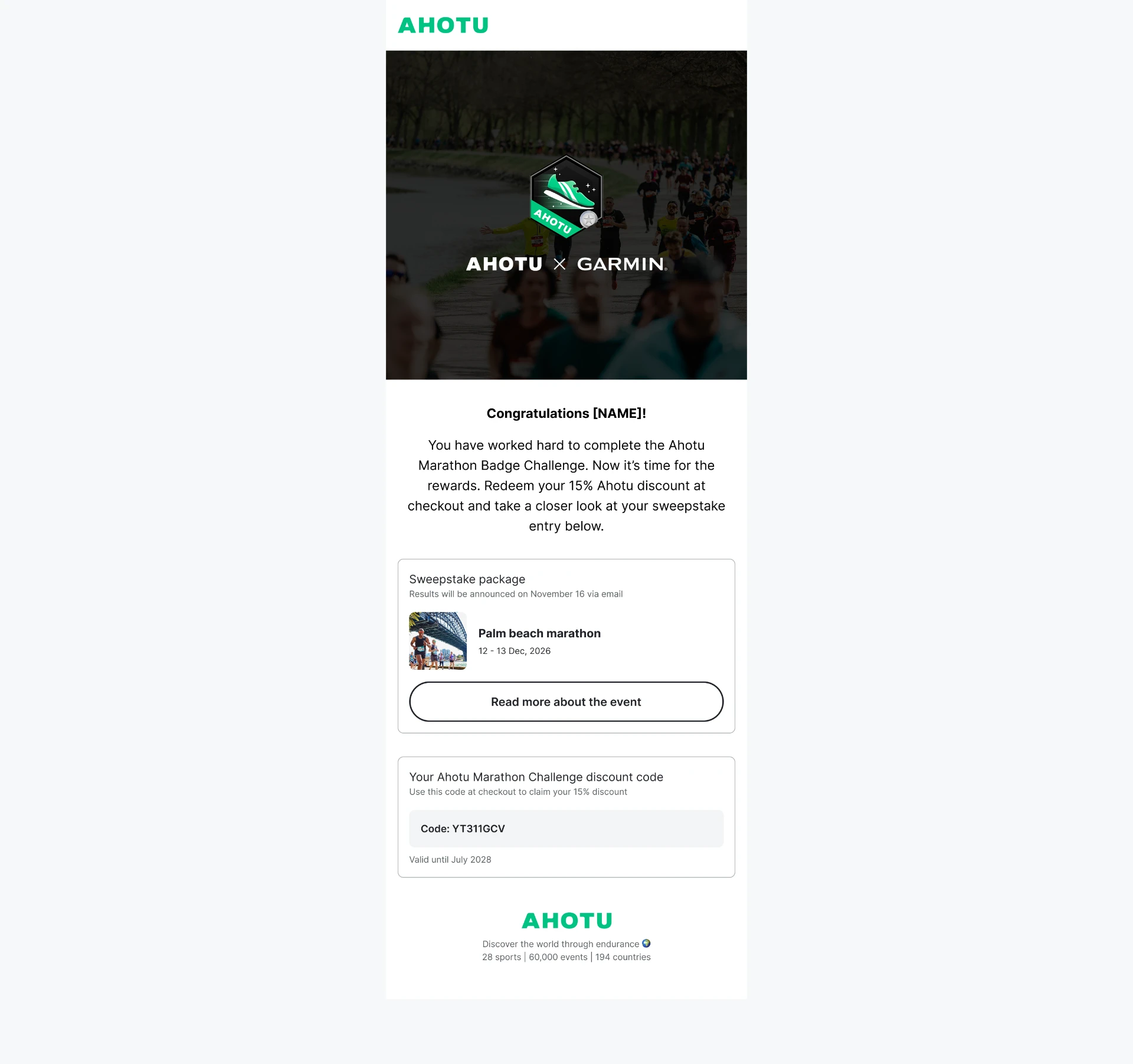
BOTH REWARDS: Same hierarchy as the profile page: sweepstake entry with its announcement date, discount code with its expiry. A user who sees one surface recognises the other.
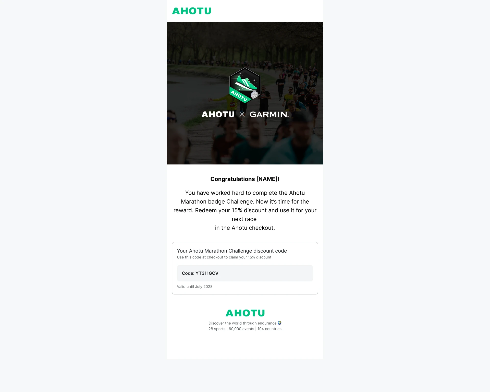
DISCOUNT ONLY: For users who skipped the sweepstake. Nothing in it hints at what they opted out of.
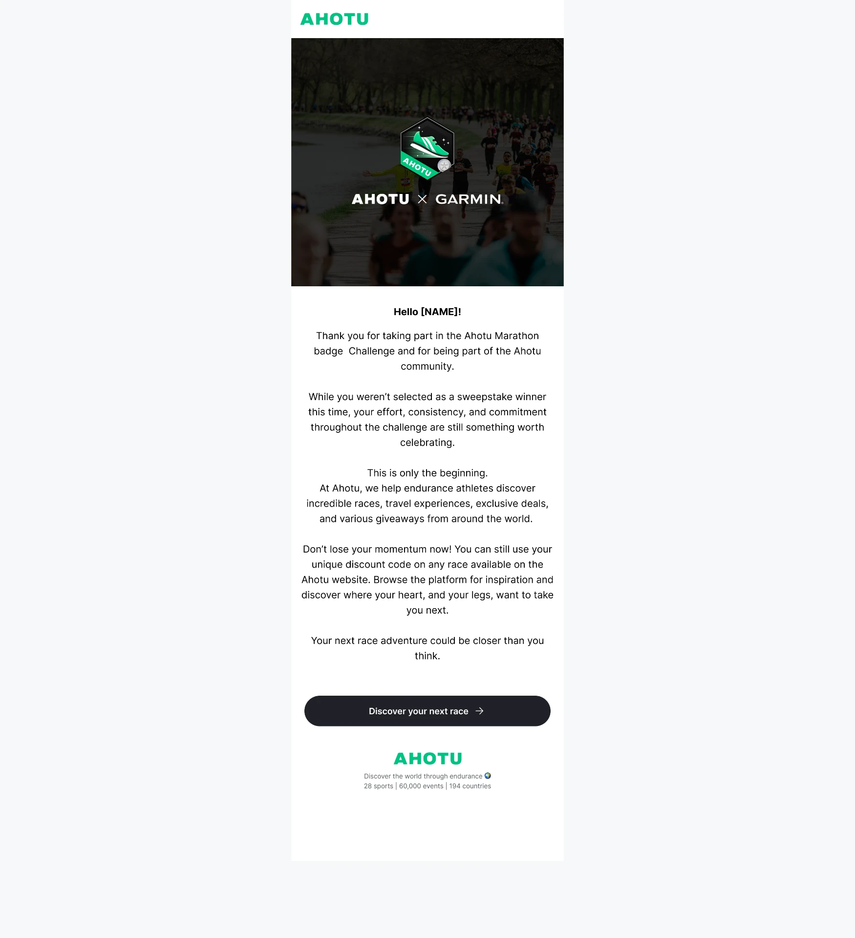
NOT SELECTED: The result is stated once, briefly, and the rest of the email is about what the user still has.
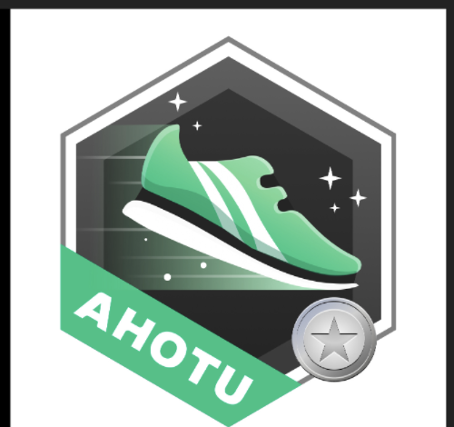
THE BADGE: Several concept passes before the shipped version. It resolved as a gradient illustration rather than flat vector, which settled the export format as PNG rather than SVG, and that in turn set how it could be used across the site and in email.
The shipped flow reads as though the decisions were obvious
Most of them weren't.
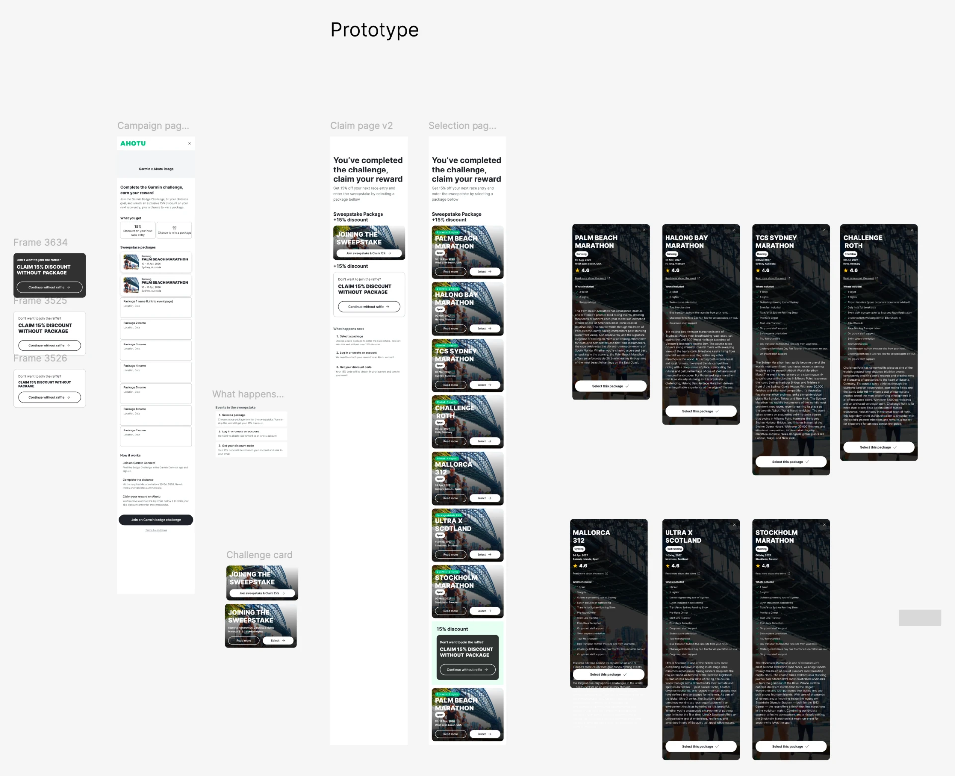
FIRST PROTOTYPE: Everything in this version calls it a raffle. It shipped as a sweepstake, a change that touched every screen, both emails, and the terms.
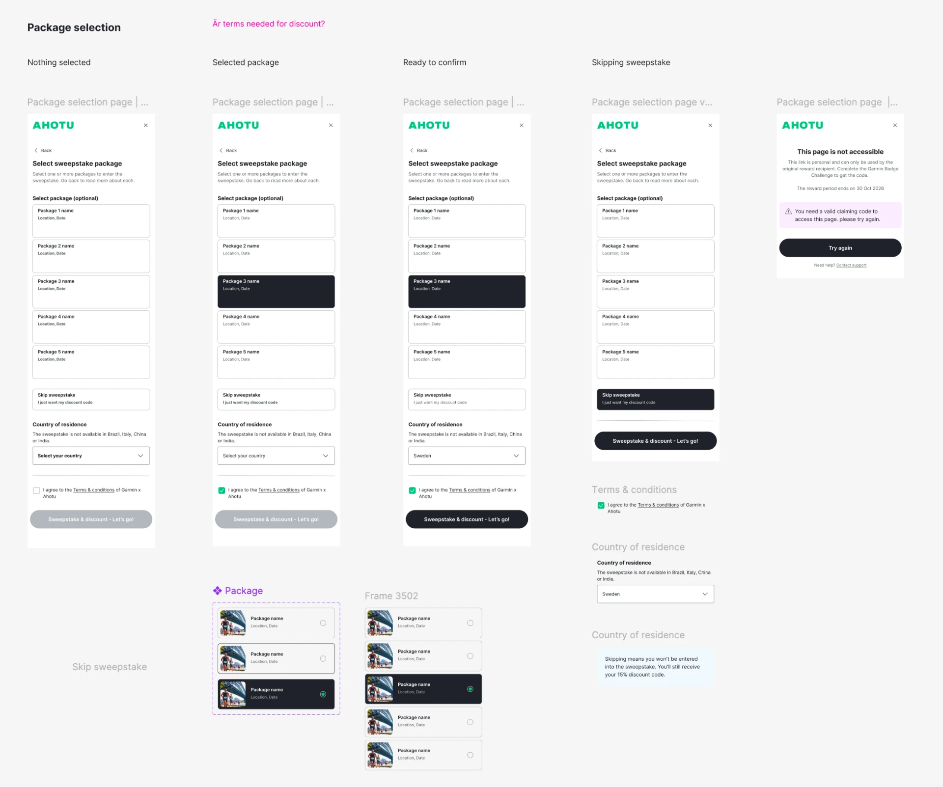
MULTIPLE SELECTION, BEFORE IT WAS CUT: Select one or more packages. The states were drawn, the component was built, and it still went out with one selection, because more entries would have implied better odds the draw didn't actually give.
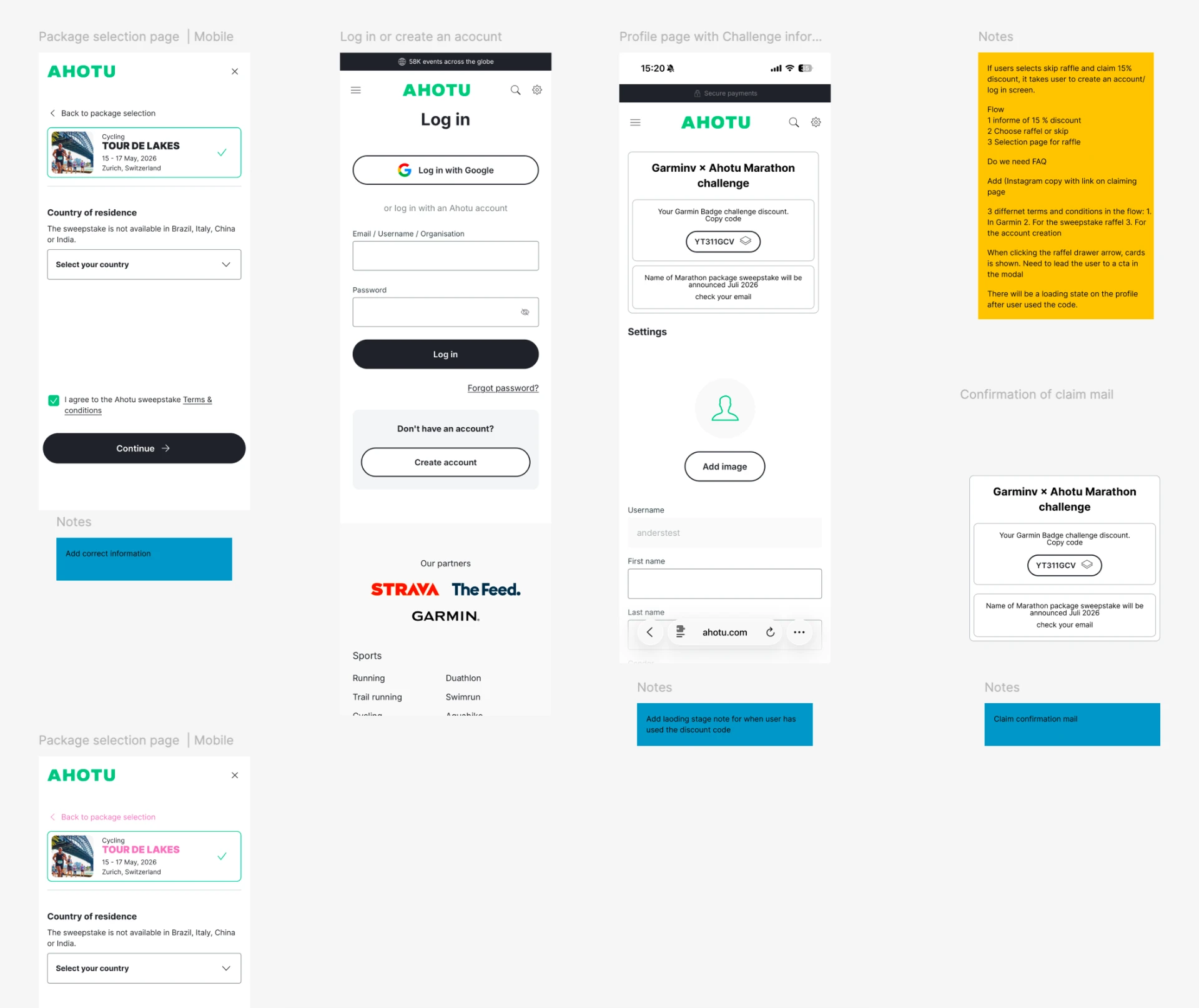
NOTES ON THE WORK: A later pass, annotated in place: which terms apply where, what happens on skip, where a loading state was still missing.
Five testers, none of whom had seen any part of the project
Colleagues had already been through the flow often enough that their reactions weren't worth much, so the test was run with people encountering it cold, in the browser, using a Google Form to report as they went.
All five correctly identified that they had received both the discount and the sweepstake entry. That was the one thing the flow had to get right, and it held. The useful findings were elsewhere.
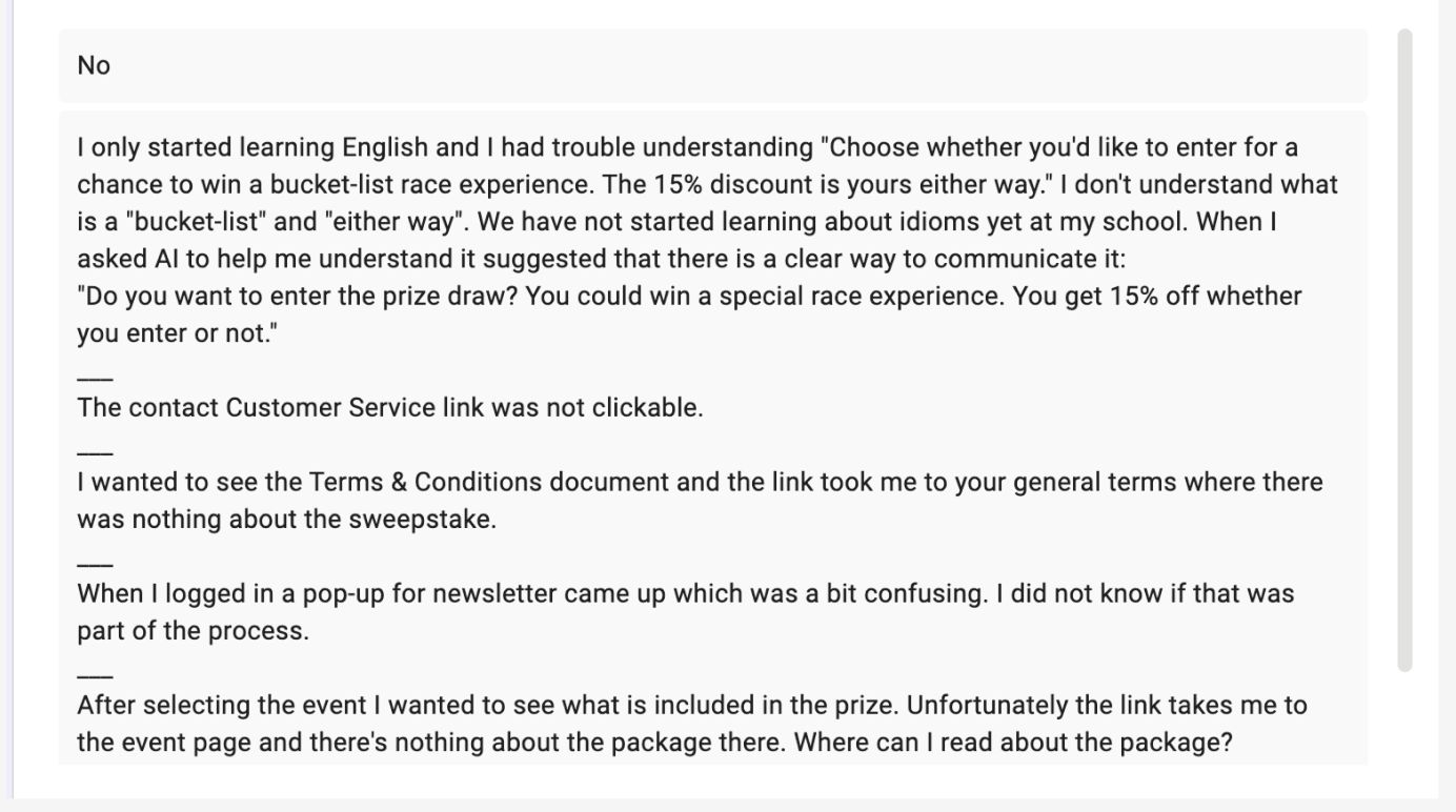
ONE TESTER, THREE REAL PROBLEMS: Response to: was anything confusing or missing when browsing the packages?
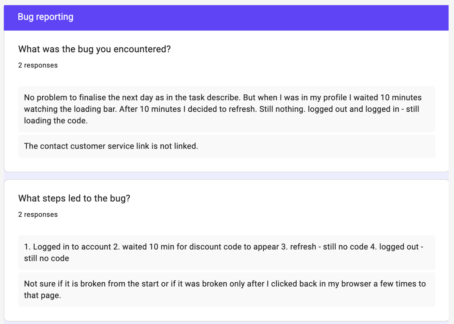
BUG REPORTS: A discount code that never resolved out of its loading state, and a support link that pointed nowhere.
A Garmin participant with no Ahotu account becomes a member, holding a reward they can find again, in six screens.
testers correctly identified that they had received both the discount and the sweepstake entry. Small sample, but direct evidence on the one thing this project set out to get right: that neither reward could be mistaken for a condition of the other.